Bedding · Bedroom Styling
Duvet Covers and Bed Skirts: How to Coordinate Layers Without Overcrowding
A bed is a generous surface, and therefore an easy one to overdecorate. The trick is not to make every layer agree; it is to give each one a purpose. A duvet cover can carry the color or pattern, while a bed skirt quietly finishes the outline below. When their hues, textures, and proportions are considered together, the result feels composed rather than assembled in a hurry.
Begin with the room, not the shopping list
Before choosing a duvet cover and bed skirt, look at the bedroom as it actually is: the color of the walls, the shape of the bed frame, the flooring, the curtains, and the things that cannot be edited out for a photograph. A room may already contain a dark wooden headboard, a patterned rug, and a pair of curtains with more personality than their owner remembers. The bed need not add another argument.
Start by naming the atmosphere you want. Perhaps the room should feel cool and spare, like a guest room kept ready for someone who may arrive late. Perhaps it should feel warmer, with earthy shades and tactile fabrics that make winter seem a little less officious. This is not a request for a rigid decorating theory. It is simply a way to give choices a common direction before the bed accumulates layers by accident.
A shared color direction is often enough. That does not mean the duvet and skirt must be identical. It means they should appear to belong to the same conversation. A mineral-blue cover might sit comfortably above a charcoal or slate skirt; cream can soften a deeper olive; a warm sand shade may connect a patterned duvet to wood furniture. The colors can differ, so long as their relationship feels deliberate.
For a restrained scheme, choose one principal color, one supporting neutral, and—if the room can bear it—a smaller accent. The duvet cover usually occupies the largest visible area, so it can carry the principal color. The bed skirt, seen in a narrower band, is well suited to a supporting tone. Accent colors can then appear in a sham, throw, or small decorative detail. The bed begins to look layered, but the eye is not asked to keep score.
Matching is one option, not a rule
There is a certain satisfaction in a precisely matched set. The bed looks orderly, the colors are settled, and no one has to wonder whether the pieces belong together. But matching every layer can also flatten the composition, especially when the duvet, skirt, shams, and other accessories share the same color and finish. The bed becomes a single block of fabric, rather than a sequence of useful surfaces.
Contrast offers another route. It need not be dramatic. A difference in texture can provide all the distinction required: a smooth cotton duvet cover above a softly brushed skirt, or a crisp percale cover paired with a skirt that has a more substantial weave. The colors remain close, but the materials tell the eye where one layer ends and another begins.
Texture is most effective when it is allowed to do its work without competition. A waffle duvet cover has a noticeable three-dimensional surface; it may need little more than a plain skirt beneath it. A lustrous sateen cover already catches the light, so a quiet matte layer below can steady the effect. With crisp percale, the contrast might come from a more relaxed or softly textured skirt rather than another prominent pattern.
Patterns require a little more diplomacy. If the duvet is busy, let the skirt be solid or nearly solid. If the skirt includes pronounced details, keep the upper layer comparatively calm. Two patterns can share a bed, but they should differ in scale or intensity: a broad, quiet motif with a small, low-contrast one is generally easier to read than two designs of equal strength. When in doubt, remove one pattern and see whether the room exhales.
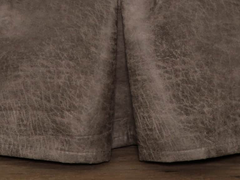
Some coordinated bedding makes the relationship between pieces explicit. The Spearhead Dusk Bed Skirt, for instance, pairs a steely-blue palette with chenille and leather-fringe details. In a room using that sort of expressive texture, a simpler duvet cover can provide welcome space around the decoration. A richly colored bed skirt can be the distinctive note; it does not need to be echoed on every surface.
Give each layer a job
Overcrowding often begins when every layer is asked to perform the same task. The duvet cover is both a practical enclosure for an insert and the bed’s largest field of color. A bed skirt conceals the space beneath the mattress and creates a finished line around the base. Sheets sit closest to the sleeper. Shams and throws may add decoration or another measure of warmth. These roles overlap a little, but they are not interchangeable.
Thinking in terms of function can make editing easier. If the duvet cover is already patterned, the skirt need not introduce a second focal point. If the bed frame is handsome and you prefer to see it, a bed skirt may be unnecessary. If storage beneath the bed is useful, a skirt can conceal boxes and keep the room’s lower edge from looking unsettled. There is no virtue in adding a layer that solves a problem the room does not have.
The same principle applies to warmth. A duvet insert, blanket, and throw can all contribute insulation, but piling them on because a bed looks unfinished is a poor substitute for understanding what the sleeper needs. A bedroom that runs warm may call for breathable bedding and fewer layers; a cold room may justify a warmer insert. Comfort is not improved merely by increasing the number of objects on the mattress.
It helps to make the bed in stages. Begin with the fitted sheet and duvet, then add the skirt and any additional layers one at a time. Pause after each addition. If the bed already feels complete after the duvet, perhaps the remaining pieces should be small or understated. If it lacks a visual foundation, a skirt may be the missing element. This method is less glamorous than buying an entire set at once, but it makes it easier to see what the room is asking for.
Proportion is part of the design
A bed skirt can be perfectly attractive in isolation and still look wrong on a particular bed. Its drop—the distance from the top of the foundation or box spring to the floor—needs to suit the mattress height and frame. A skirt that is too short may hover awkwardly above the floor, exposing a strip of under-bed space. One that is too long can drag, bunch, or catch dust and feet. Neither effect is usually improved by adding more pillows.
Measure before choosing. With the bed assembled as it is normally used, measure from the surface where the skirt will sit to the floor. Account for the mattress, foundation, frame, and any topper that changes the bed’s height. Product specifications may describe the skirt’s drop or available size; compare that information with the actual bed rather than relying on a general impression of what a standard bed should be.
The duvet also has proportions to consider. Its edges should provide enough coverage for the mattress and the people sleeping beneath it, while hanging in a way that suits the bed frame and the room. A cover that is too small may reveal the insert or leave the sides looking skimpy. An oversized duvet can make a low bed seem engulfed. Check the dimensions of both the cover and insert, and consider whether the mattress is unusually deep or the bed frame especially low.
How the duvet is arranged changes its visual weight. Pulled smooth and square, it creates a more tailored impression. Folded back at the head of the bed, it reveals the sheet and makes the bed appear more layered without adding another object. A relaxed drape can soften a formal room; a neatly aligned edge can bring calm to a patterned one. These small adjustments are often more effective than buying another decorative piece.
Access matters, too. A bed skirt should not make it difficult to reach under the bed, open storage drawers, or move around the frame. A duvet should not drag into walkways or obscure an attractive bed rail. Bedroom styling is most successful when it survives ordinary use: getting in and out of bed, changing the sheets, opening a drawer, and walking across the room without negotiating a fabric obstacle course.
Make texture visible, but not loud
Bedrooms are often seen in soft, indirect light, which gives texture a particular importance. A matte cotton percale has a crisp, dry look; sateen has a smoother surface and a gentle sheen; waffle weave creates depth through its raised structure. These differences can make a simple palette feel considered. They also affect how the bedding feels against the skin, which matters more than any bedroom photograph.
For a cool, uncomplicated arrangement, a breathable cotton cover in percale can be paired with a quiet skirt in a close neutral. For a softer impression, sateen above a plain, brushed fabric may create a subtle contrast between sheen and softness. A textured duvet cover can become the bed’s principal feature, while the skirt remains plain enough to frame it rather than compete. The point is not that any one weave guarantees a better night’s sleep; personal preference, room temperature, and care needs all matter.
More pronounced materials call for more restraint. Leather accents, fringe, and bold woven motifs make a strong visual statement. The Moreno Midnight Bed Skirt, with dark blues, indigos, and tactile trim, illustrates how a skirt can contribute substantial character on its own. In a room built around such details, plain sheets and a quieter duvet cover can make the rich lower layer feel intentional rather than crowded.
A useful test is to stand at the bedroom door and look at the bed from a distance. If the eye lands on several unrelated details at once, simplify. If every surface looks uniformly smooth and the bed feels too flat, introduce one texture—not three. The successful arrangement often contains a moment of interest and enough calm around it for that interest to register.
Keep care instructions in the picture
Bedding is not a still life. It is washed, slept in, folded, spilled on, and sometimes pulled into service by a guest who has never met the duvet ties. The care requirements of the duvet cover and bed skirt should therefore be considered before the colors are finalized. A set that looks harmonious but requires two incompatible routines may become a source of unnecessary work.
Check labels and product information for washing temperature, drying method, and any restrictions. Cotton pieces may often be machine washed, but construction, finishing, and manufacturer instructions differ. Decorative skirts with fringe, faux-leather accents, wool, or other special details may require more attention than a plain cotton cover. Do not assume that two items can go in the same load simply because they share a color.
Separate pieces by their practical needs, not only by how well they look together. Keep instructions somewhere accessible, especially for bedding with a specialized fill or trim. If a piece calls for spot cleaning or professional laundering, decide whether that fits your routine. A beautiful layer that is difficult to maintain may be best reserved for a guest room or used in a way that limits frequent washing.
Fabric choice also affects the lived experience of the bed. Breathability, softness, durability, and the way a material responds to repeated laundering are all worth considering. Organic cotton, for example, is available in different weaves and finishes, so “cotton” alone does not describe the feel. Percale tends toward a crisp, airy hand; sateen feels smoother. A duvet cover should be chosen for the texture you enjoy against your skin, while the skirt can be selected for its appearance and how well it holds up in its position.
Easy care is not a glamorous design feature, but it is a dependable one. A room is more likely to remain orderly when its bedding can be refreshed without special improvisation. That practical ease is part of the composition, even if it never appears in a color palette.
A few reliable approaches
There is no universal formula, but a few starting arrangements can help clarify the choices. For a quiet, tailored bed, use a solid duvet cover and a bed skirt in a related neutral, varying the weave or finish rather than the color. This works especially well when the room already has strong architecture or patterned curtains.
For a bed with a patterned duvet, choose a skirt that borrows one muted color from the pattern. It need not match exactly; a slightly deeper or paler version often looks more natural. Keep the sheets simple, and let the duvet do the speaking. If the pattern is large, avoid repeating it in several smaller accessories.
For a richly textured skirt, reverse the balance. Keep the cover relatively plain and use the sheets or a small accent to connect the upper and lower layers. This gives the skirt room to contribute its character while preserving a sense of order across the bed.
For a small bedroom, limit contrast and reduce the number of visible layers. A close tonal range can make the bed feel less like a large object occupying the room. A well-fitted skirt may conceal under-bed storage and reduce visual clutter, while a duvet cover with a restrained pattern keeps the upper surface from becoming monotonous. The aim is not to make the bed disappear, but to avoid making it the only thing the room can see.
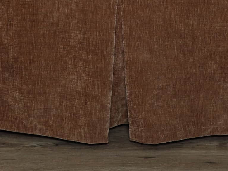
For a room that needs more warmth, choose deeper or earthier colors and bring in texture selectively. A bed skirt in a muted brown, blue, or green can anchor a lighter duvet. A single folded throw may complete the arrangement. If the room is already full of dark furniture, however, a pale duvet can provide relief. Balance is a matter of what is already present, not a rule that every bedroom should be light or every rustic room should be brown.
An editing pass before you call it finished
When the bed is made, look at it from the doorway, then from beside it. Ask whether the duvet and skirt share a clear relationship. Check that the skirt falls evenly, does not drag, and leaves practical access to the bed frame. Notice whether the duvet reaches far enough over the sides and whether its pattern or texture has become the sole point of attention—or one of too many.
Remove one item at a time if the arrangement feels busy. Often the answer is a decorative sham, a second throw, or a competing pattern rather than the duvet or skirt themselves. The bed should have enough layers to look finished and function comfortably, but not so many that making it becomes a daily act of negotiation.
Then consider the room’s actual rhythms. Can the cover be washed when needed? Does the skirt interfere with storage? Is the bedding comfortable at the temperature you sleep in? Does the arrangement still look composed when the duvet is not pulled to military precision? A useful bedroom is not obliged to remain perfectly staged. It should recover gracefully from use.
Coordinating a duvet cover and bed skirt is ultimately an exercise in proportion and restraint. Choose a shared color direction, decide where contrast will be most useful, and let one layer take the lead. Measure the bed rather than guessing; check care instructions before committing; and give each piece a reason to be there. The reward is not a bed that looks expensive or elaborate. It is a bed that seems to belong in its room—and to the life being lived there.
A quick checklist
- Choose a shared color direction before deciding whether the pieces should match or contrast.
- Let either the duvet cover or the bed skirt carry the strongest pattern or texture, not both by default.
- Measure the bed skirt drop and check duvet dimensions against the mattress and frame.
- Leave practical room for drawers, under-bed access, and comfortable movement around the bed.
- Compare care instructions and fabric feel with your everyday routine.
- Remove a layer if the finished bed feels busy, difficult to maintain, or uncomfortable to use.